
Artemis II Launch and Melbourne's Seasons Highlight The Crunch Newsletter
This week's edition of The Crunch newsletter brings a fascinating mix of space exploration, weather patterns, and global economic insights. While the Artemis II mission captures headlines, the newsletter also delves into Melbourne's seasonal quirks and the ongoing fuel crisis, using innovative data visualizations to tell these stories.
Is Space Becoming Too Crowded?
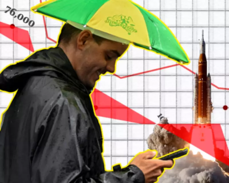
One of the standout features this week is a visualization of the 32,000 objects currently orbiting Earth. This number has skyrocketed from about 7,000 in the 1970s and 20,000 in the 1990s, raising concerns about space debris and potential chain reactions. An animated map illustrates this growth, making the data both engaging and alarming. The newsletter includes additional charts that explore the implications of this crowded orbital environment, highlighting the need for sustainable space management.
Tracking the Fuel Crisis in Australia
In Australia, The Crunch team has been closely monitoring the fuel crisis. An animated map shows hundreds of service stations experiencing outages of one or more fuel types as of early April. This page is regularly updated with the latest fuel prices, outages, shipments, and national fuel reserves. Collaborations with journalists from the ABC provide estimates of fuel prices by capital city and regional areas, noting how price variations have decreased as margins tighten.

Melbourne's Seven Seasons Revealed
Contrary to the traditional four seasons, software developer Max Craigie's app suggests Melbourne has seven distinct seasons. Using cosine similarity to match weather data with season names, this analysis aligns with the cultural knowledge of the Wurundjeri and other Kulin Nation peoples, who have long recognized seven seasons based on plants and animals. The newsletter also references a past quiz to help residents find ideal living locations based on Melbourne's famously variable weather.
Detailed Maps of the Strait of Hormuz
The New York Times has produced an incredibly detailed map of the Strait of Hormuz, helping readers understand the geography of the Persian Gulf and key sites like Kharg and Larak. This complements other map pieces, such as visualizations of war scales and bridge destructions in southern Lebanon, providing context to global conflicts and economic dependencies.
Global Fertilizer Blockade Impact
A visual guide from UK colleagues examines the fertilizer blockade, showcasing a map of global dependence on Gulf fertilizer imports. This includes a Sankey chart, an underrated but effective visualization tool, to illustrate trade flows and potential impacts on agriculture worldwide.
Artemis II Interactive Visualizations
Although not included in the print newsletter due to permission issues, The Crunch highly recommends interactive visualizations of the Artemis II mission from sources like the ABC and New York Times. These feature animated timelines and detailed graphics of the spacecraft, with Bloomberg and Die Zeit offering additional engaging content, including 3D animations and beautiful designs.
Bookmarks and Additional Insights
The newsletter also highlights bookmarks on topics such as data visualization with textiles, early flower emergence after a warm March, and social trends like men marrying up. It touches on stories from Hong Kong's democratic opposition and includes a call for readers to share the newsletter and provide feedback.
Overall, The Crunch continues to deliver in-depth analysis through creative data presentations, making complex topics accessible and engaging for its audience.