Ever wondered how the Tube would look if you could see the different lines from the air? A fascinating image produced by Martin Bangratz provides just that perspective. Inspired by a Reddit post displaying an aerial photograph of London in 2018, Bangratz realized he could reimagine the Tube system from a distinctive angle. He obtained approval from the original photographer, known online as @djsantero, to superimpose the Tube diagram onto the overhead view of London.
An Iconic Map Reimagined
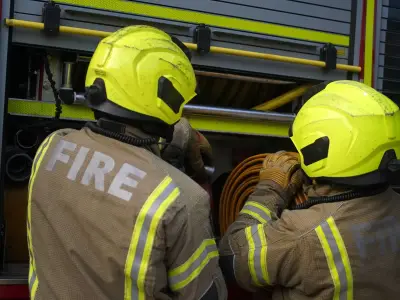
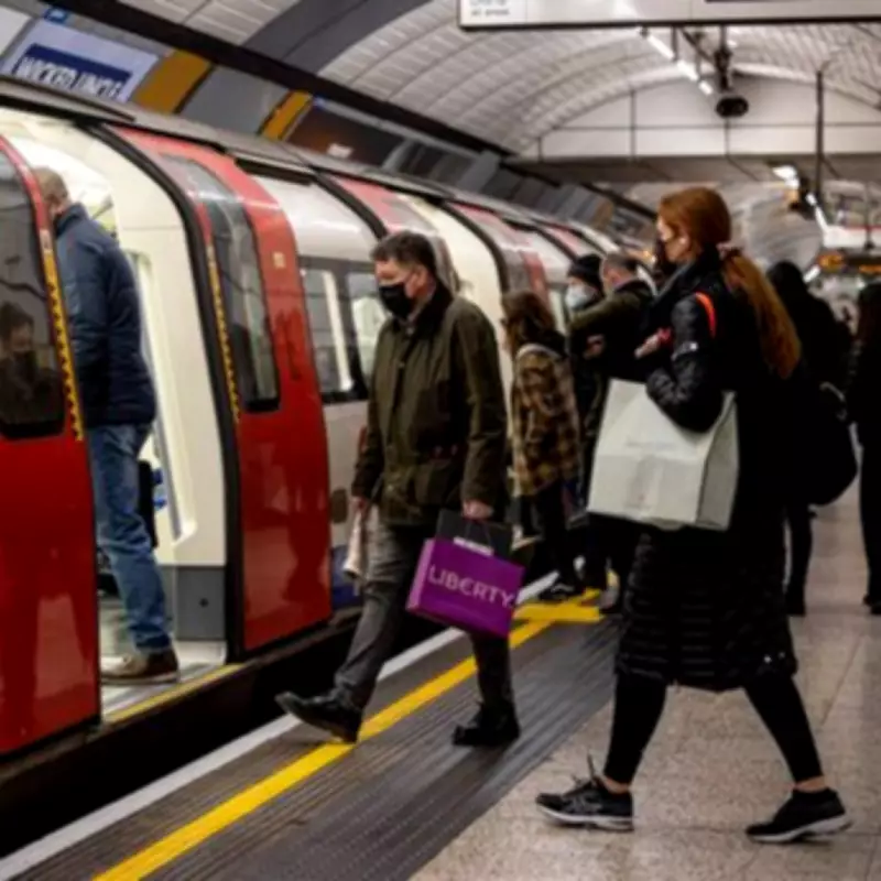
London's Underground system is an icon of the city, and its unwritten rules are ingrained in every Londoner. The code is simple: never block the left side of escalators, and steer clear of striking up chats with fellow travellers under any circumstances. The TfL map itself is rather iconic, though it prioritises clarity over geographical precision. Bangratz's resulting creation provides a captivating aerial perspective where the recognisable lines of the Tube are mapped out in their signature colours, weaving like coloured strands linking the city's landscape.
It's a bit of a mess from the air, but that's part of its charm. Not content with his original work, Bangratz refined his aerial piece to incorporate the Overground, Docklands Light Railway (DLR) and even the Waterloo and City line.

Walking Times Between Stations
There are also several official variations of the map. One such version shows the walking duration between stations. Within Zone 1, certain journeys can be covered in a swift three-minute stroll. The gap between Charing Cross and Embankment is notably short, as is the stretch from Leicester Square to Covent Garden – a route that TfL itself recommends tackling on foot.
On the other end of the scale, the walk from White City to East Acton is a considerable 25-minute trek, while the hike from Mile End to Stratford is a whopping 43 minutes.
Sign up for our London Underground newsletter for the latest travel updates to make your commute easier, plus a weekly fix of Tube trivia!