
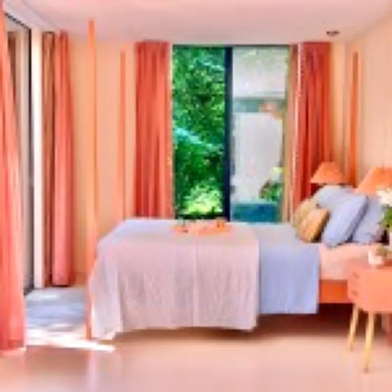
Interior designer Anna Jacobs declares that powder blue is set to dominate home decor in 2026, marking a shift away from the earthy browns and deep reds that characterised the previous year. According to Jacobs, the new trend reflects a collective desire for calm and spaciousness after a period of global uncertainty.
From Woodland to Meadowland
Jacobs, who taught Colour for Interior Design at Chelsea College of Arts and runs her own homeware line, explains the transition: 'It's almost like last year we were in a woodland. We were burying ourselves under those brown, barky tones, and now we're coming into a meadowland.' She notes that mocha was Pantone's 2025 Colour of the Year, with plums, burgundies, and deep earthy tones prevalent. 'Warm reds and grounding browns really came in because the world has been in chaos. People have wanted to feel comforted, cocooned and close to a sense of earthliness,' she adds.
Pantone's 2026 Choice: Cloud Dancer
Pantone's 2026 Colour of the Year is Cloud Dancer, a light, airy shade. Jacobs, a self-described maximalist, praises the choice: 'This is controversial, as I'm a maximalist in my own home, I'm part of a full-on colour community. I actually thought it was great. In the midst of colour and chaos and intensity, a white or very light shade punches through it and offers some relief.' She has personally adopted powder blue bedsheets in the farmhouse she is renovating, noting it matches Dulux's 2026 Rhythms of Blues forecast. 'I've never had blue linen before, but I was craving the colour — I just needed it in my life,' she says.

Biophilic Design Softens
While biophilic design remains influential, Jacobs observes a softening of palettes. 'Along with pale blue I'm seeing more light corals and pinks. Instead of a warm, olive green I'm seeing cooler, mineral greens. They're still natural colours, but everything's softening slightly,' she explains. This shift is not merely aesthetic but psychological: 'Most of us are not aware of how much colour affects us all the time. We walk around this colourful world and our brains react to those different lightwaves coming through our eyeballs. We crave peace and calm, and blues and greens are psychologically proven to relax us, partly due to the subconscious association with water. The colour blue can literally lower your heart rate in times of stress. That's why pastel blues and greens are often used in hospitals.'
Personal Colour Choices
Jacobs advises homeowners to trust their instincts: 'Some people are reluctant to use colour, but it's really easy. Look at the colour of your clothes, how wearing those colours makes you feel.' She urges against one-size-fits-all decorating rules: 'Don't be afraid of injecting soul into a place with colour, but don't be bullied into using colour if you don't want it. If neutrals are right for you, go with that. If a bright orange room would bring you joy, enjoy it! Different colours mean different things to different people, so always listen to your gut.'
Finalists in the uFurnish.com Home Awards will be announced on August 4th, with the ceremony on October 19th at the Kimpton Fitzroy Hotel London.