
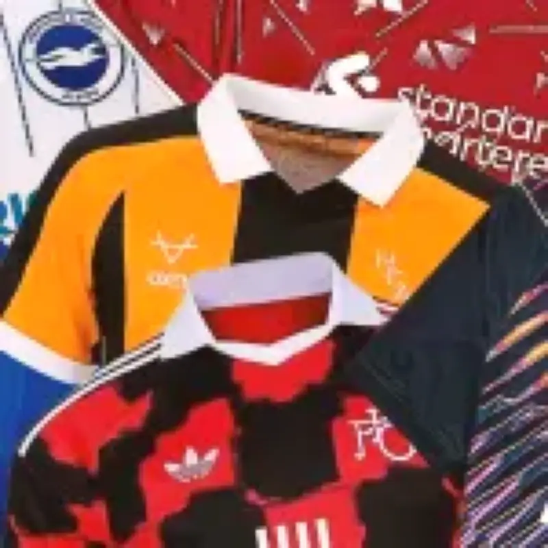
Hull City's home kit, made by local firm Oxen, has been named the best new strip for the Premier League 2026-27 season, while Nottingham Forest's home shirt, described as looking like a tie-dyed Turin Shroud, is ranked the worst. The rankings were compiled by Gavin Brown and Steve Charnock for Metro.
Top 10 best kits: Hull City leads the way
Hull City's home shirt, the last club invited to the Premier League party and favourites to be the first to leave, earned the top spot for its timeless look, smart collar, and lettered logo. Brown said: “We can’t guarantee points but they might top the league for sartorial elegance.”
Ipswich Town's away shirt, based on a colour palette from a late 1990s classic, ranked second. The horizontal black and red pinstripes on a cream base were described as “pleasing” by Brown. Coventry City's away shirt, an understated off-white, navy, and coral design, came third, with Brown noting that “the change strip is Cov’s speciality.”

Sunderland's home kit, paying tribute to the 1937 FA Cup final win, ranked fourth. Brown praised its simplicity, stating: “Hummel don’t do bad kits.” Manchester United's away shirt, a simple blue design with red trim, took fifth place, with Brown saying it “oozes class and competence, qualities all too lacking at United of late.”
Nottingham Forest away and Spurs kits shine
Nottingham Forest's away shirt, a dark green design with red trim, ranked sixth. Brown noted: “All you need to know is dark green with a red trim go surprisingly well.” Tottenham Hotspur's away kit, a dark navy base with jagged diagonal streaks of metallic pink, blue, orange, and violet, ranked seventh. Charnock said: “Even if you’re not into it, you can’t say it’s not original.”
Tottenham's third kit, featuring a purple design evoking memories of 30 years ago, ranked eighth. Charnock described it as “nostalgia done right.” Fulham's away shirt, giving early 1990s AC Milan vibes in a patchwork style, ranked ninth. Charnock called it “bellissimo.” Chelsea's home shirt, with a simplified lion badge and subtle full badge woven into the fabric, rounded out the top 10. Charnock said: “It’s a classy little number.”
Bottom 10 worst kits: Nottingham Forest home takes the crown
Nottingham Forest's home shirt, with a marbled effect representing “the mist rolling in from the Trent,” was ranked the worst. Charnock said: “It looks more like the Turin Shroud’s been tie-dyed red and used to wipe down a mechanic’s oily spanners.” Arsenal's home kit, with awkward raglan sleeves and burgundy trim, ranked 19th. Charnock added: “It somehow manages to be both fussy and boring.”
Crystal Palace's home shirt, with a red and blue sash on a white shirt, ranked 18th. Charnock questioned: “That’s a Palace away shirt, not a Palace home shirt, surely?” Brentford's away kit, inspired by Savile Row tailoring from the Kingsman films, ranked 17th. Charnock noted: “It just looks like a Millwall kit.” Brighton's away shirt, a complete flip of the home kit, ranked 16th. Charnock said: “For a cool city with a population made up of about 70% graphic designers, this is almost unforgivably uninspired.”
Fulham third, Sunderland away, and Newcastle home among the worst
Fulham's third kit, a neon nightmare, ranked 15th. Charnock described it as: “A migraine in sartorial form. A vaporwave-inspired explosion in a cheap glowstick factory.” Sunderland's away shirt, created in collaboration with Elvis Presley, ranked 14th. Brown said: “The blurb claims the shirt was ‘created in collaboration with’ Elvis Presley – a bold boast for a kit released 49 years after the King of Rock ‘n’ Roll drew his last breath.”

Newcastle United's home shirt, which features vertical black and white stripes, ranked 13th. Brown said: “It shouldn’t be possible to take iconic, vertical black and white stripes and get it this badly wrong, but adidas have proved more than up to the challenge.” Manchester United's home kit, described as looking like a counterfeit version, ranked 12th. Brown said: “It might look better on the shoulders of a £100million player in a big game under the lights, but don’t count on it.” Liverpool's home kit, evoking the late 1980s era, ranked 11th. Brown said: “It’s evocative alright and it should work. And yet, somehow, it doesn’t.”