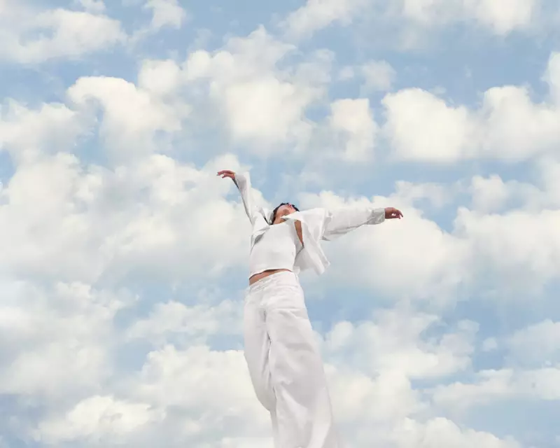
Pantone, the self-described global authority on colour, has ignited a fierce debate with its selection for the 2026 Colour of the Year: a shade of off-white named 'Cloud Dancer'. Announced in December 2025, the choice has been met with criticism and analysis, with commentators linking it to rising white nationalism, the decline of diversity initiatives, and shifting fashion aesthetics.
A Controversial Choice in a Polarised Climate
For over a quarter of a century, Pantone's annual colour announcement has served as a cultural barometer. The selection for 2026, described as 'a billowy white imbued with serenity' and a symbol for 'calming influence', arrives amidst a contentious backdrop. Critics have labelled the timing as 'Pantone-deaf', pointing to the rise of white nationalist movements and the rolling back of Diversity, Equity, and Inclusion (DEI) programmes in both the UK and US.
Laurie Pressman, Pantone's vice-president, defended the choice to the Washington Post, stating skin tones were not a factor. This defence further fuelled discussions around 'wokeism' and the politics of colour. Despite the controversy, Pantone is proceeding with commercial collaborations, including partnerships with Motorola, Post-it Notes, and Play-Doh.

Expert Reactions: From Dog-Whistles to Decorating Basics
The reaction from cultural and industry experts has been sharply divided, highlighting the complex layers of meaning assigned to a simple hue.
'A White Supremacist Dog-Whistle'
Writer and content creator Gabrielle Minoli was unequivocal, stating the shade has been 'clocked as a white supremacist dog-whistle'. Minoli criticised the justifications for the colour, linking its 'blank slate' description to the language of generative AI that chips away at human creativity. 'It reminds me of the uncanny veneers of a Fox News broadcaster,' Minoli said. 'It's the threatening silence of a suburb that has driven out anyone with a skin tone deeper than beige.'
'It Feels Like a Eugenics-y Move'
Nicole Ocran, writer and co-author of 'The Half of It', shared a similar concern. Noting trends like the 'clean-girl aesthetic' and 'tradwives', Ocran's immediate reaction was that the choice felt deliberate. 'It feels like a eugenics-y move. It's impossible to separate politics from fashion,' Ocran argued. She highlighted the pressure to conform to a specific, purity-associated aesthetic, seeing Cloud Dancer as 'a stripping back of any individuality'.
'It Doesn't Bring Anything New'
From an interior design perspective, Paddy O'Donnell, a brand ambassador for Farrow & Ball, saw less controversy and more commercial predictability. 'Our bestselling paints are always white, so it's a bit of a non-story,' he remarked. He compared Cloud Dancer to warm, nuanced off-whites like Farrow & Ball's Ammonite, describing it as a useful trim colour. O'Donnell noted that while Pantone promotes this white, he is observing a huge surge towards lilacs, terracottas, and rich browns in interior trends.
'It's Incredibly Neutral'
Colour consultant Jules Standish analysed Cloud Dancer through the lens of personal colour analysis. She identified it as a rare, truly neutral white that doesn't lean warm or cool. Standish warned that wearing the wrong white can be unflattering, even suggesting 'if you want a sick day at work... wear it and someone will look at you and go, 'Please don't come in today.'' She concluded it would likely suit those with a 'Summer' colour palette best.
The Legacy of Predicting the Zeitgeist
Pantone's history shows its colours often resonate with the mood of the era. Following the 2009 crash, the hopeful yellow 'Mimosa' was chosen. In 2016, the blend of Serenity and Rose Quartz foreshadowed the millennial pink wave. Last year's 'Mocha Mousse' preceded a widespread return to brown in fashion and design. Whether Cloud Dancer will be remembered as a tone of calm or a symbol of division remains to be seen, but its announcement has unequivocally sparked a conversation that stretches far beyond the paint chart.